Studio Notes
The case for restraint in the modern home
We live in an era of maximum optionality — every surface can do something, every room can be something else. The designers who have lasted are the ones who learned to say no.
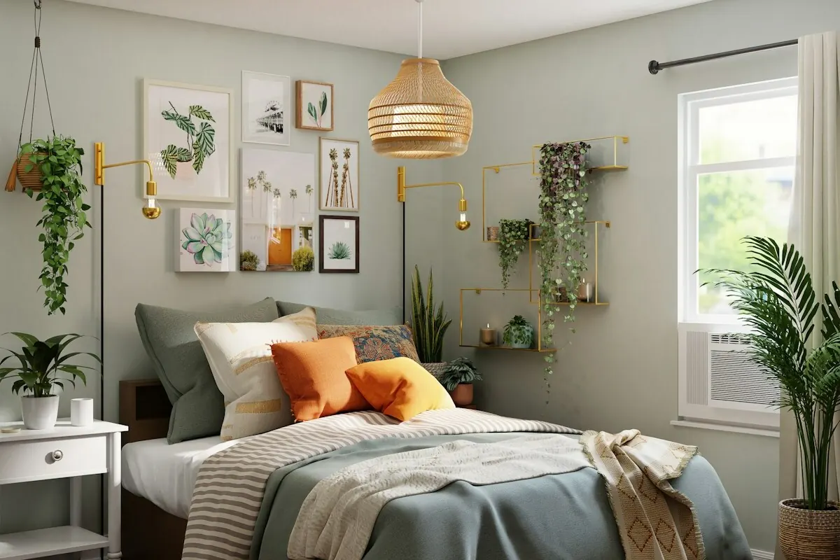
Walk through any new apartment tower in Raipur or Bhopal a year after handover and you can usually tell which homes were designed and which were accumulated. The accumulated ones are not badly made. They simply say yes to everything: a fluted panel here, a backlit niche there, three ceiling levels, four laminates, a feature wall in every room. Each choice looked good on a phone screen. Together they shout.
Restraint is the opposite habit. It is the discipline of deciding what a room does not need, so that what remains can be seen, used and enjoyed for a long time. It is the closest thing our studio has to a philosophy, and this note explains what it means in practice — with numbers, because restraint is a method, not a mood.
What restraint is — and what it is not
Restraint is often confused with minimalism, and minimalism with white walls, bare floors and nowhere to put anything. That is not what we mean.
- It is not beige. A restrained room can be deep green or terracotta. What matters is that one colour family leads and the others support it.
- It is not empty. A family of four with grandparents visiting at Diwali needs beds, seating and serious storage. Restraint is about how many ideas a room holds, not how many objects.
- It is not cheap. A restrained home often costs the same as a busy one. The money simply moves from decoration to the things you touch every day.
- It is editing. Every element has to earn its place by doing a job — storage, light, comfort, or one deliberate moment of beauty.
A useful test: if you can describe a room in one sentence (“a warm teak-and-linen bedroom that is dark and quiet at night”), it is probably restrained. If the description needs a list, it probably is not.
Edit before you add
Most interiors begin with a shopping list. Ours begins with a deletion list. Before we draw anything we ask clients to walk each room and name what they would remove if the room were theirs to start again: the extra side table, the second TV, the showcase of gifts nobody chose, the shoe pile at the door.
Three habits make editing stick after the designers have left:
- One in, one out. A new cushion means an old one leaves. It sounds trivial; over five years it is the difference between a room that holds its shape and one that silts up.
- The 48-hour rule for décor. Anything decorative — a vase, a wall clock, a planter — waits two days in the cart. Most of it never gets bought, and nobody misses it.
- Test with tape, not with money. Before committing to a console, a pendant or a panelled wall, mark its footprint or outline on the floor or wall with masking tape and live with it for a week. If it feels like an obstacle on day three, it will feel like one in year three.
Negative space is a material
Designers talk about negative space — the empty area around objects — as if it were a finish, because it behaves like one. A wall left bare makes the one painting on it louder. A floor with clear paths makes a small living room feel larger than its square footage. We plan it as deliberately as we plan the furniture.
Rules of thumb we actually use
- Circulation first. Keep main walking routes 900–1,000 mm clear, and 750–900 mm in front of wardrobes and deep drawers — the clearances in our design standards. Furniture that forces you to turn sideways is furniture that will be resented.
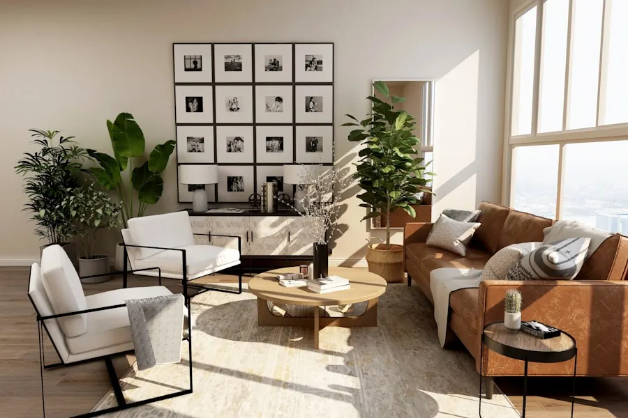
- Leave roughly a third of the wall area quiet. In a typical 12 × 14 ft living room, that means one feature wall at most — usually the TV or sofa wall — and two or three walls that are simply well-painted.
- One ceiling idea per room. A single cove or a single drop over the dining table reads as intentional. Three levels with three kinds of light read as a showroom. (Our false ceiling guide goes into the details.)
- Empty surfaces on purpose. Keep at least one horizontal surface in each room — a console top, a section of kitchen counter, a bedside — completely clear. It becomes the place things get put down, instead of everywhere.
Fewer, better materials
The quickest way to calm a home is to reduce the number of materials it contains. Our working rule is one wood, one stone (or tile), one metal as the base palette, with fabric and paint doing the rest. Everything else needs a reason.
Here is how that plays out in a typical 2BHK of about 850 sq ft carpet area:
| Element | A busy specification | A restrained specification |
|---|---|---|
| Wood tones | Four laminates (walnut TV unit, oak wardrobes, wenge bed, white kitchen) plus veneer panelling | One wood tone repeated in wardrobes, TV unit and bed; kitchen in a plain solid colour |
| Flooring | Vitrified in living, wooden-look tiles in bedrooms, patterned tiles in the passage | One large-format vitrified or stone floor throughout; rugs for warmth |
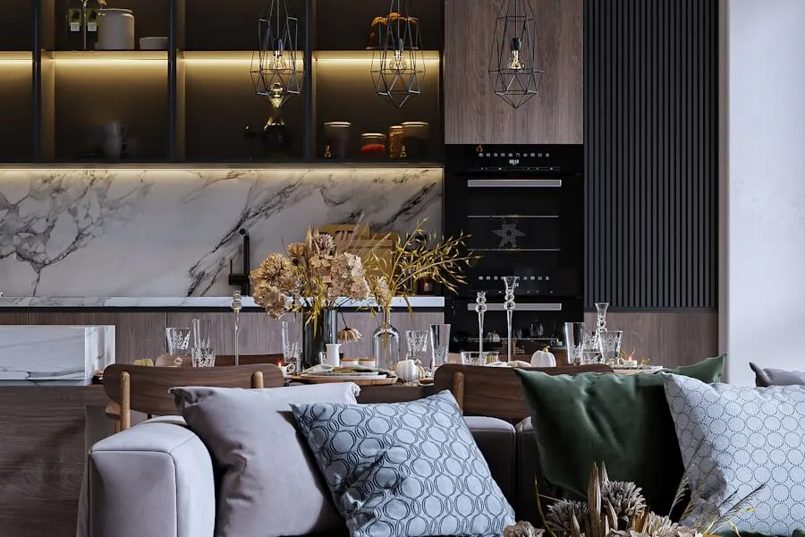
| Metal finishes | Chrome taps, gold handles, black profiles, rose-gold lights | One finish (for example brushed brass or matte black) for handles, profiles and light bodies |
| Wall treatments | Wallpaper, 3D panels, mirror strips and a texture wall | Paint in one family; one textured or panelled wall where it matters |
| Ceiling | Multi-level gypsum with cove, profile and spot lights in every room | Flat ceilings with a perimeter cove in living and master bedroom only |
The restrained column is not cheaper per item. Using one premium laminate everywhere can cost a little more than mixing a premium one with budget ones. But it is far cheaper to live with: fewer shades to match when a shutter is damaged, fewer finishes to clean, fewer things that date. Our guide to laminate, veneer and acrylic helps you choose the one finish worth repeating; it is worth seeing your shortlist side by side before you decide.
Studio test
Lay your shortlisted samples — one laminate, one tile, one handle, one paint card, one fabric — on a single A3 sheet under daylight. If anything needs to be removed for the board to look calm, remove it from the house too.
In Indian homes, storage is the precondition
Restraint fails in Indian homes for one predictable reason: there is nowhere to put things. We have more of them than the Scandinavian magazines assume — steel and brass utensils for festivals, pooja items, winter quilts that live in the loft for nine months, guest bedding, school projects, files, the pressure cooker collection. Open shelving styled with three vases does not survive contact with real life.
So a restrained home usually has more storage than a busy one, and almost all of it is closed. Our working ratio is roughly 70–80% closed storage to 20–30% open display. A few specifics:
- Full-height wardrobes (up to the ceiling, with 600–900 mm lofts above the main body) instead of 7 ft wardrobes with a dusty gap above.
- Handle-less or slim-handle shutters on long runs, so a wall of storage reads as a calm plane rather than a grid of hardware.
- A shoe cabinet at the entrance, 300–350 mm deep, so footwear never reaches the living room.
- A dedicated pooja niche or unit with its own closed storage for diyas, agarbatti and festival items, so they do not migrate to every shelf.
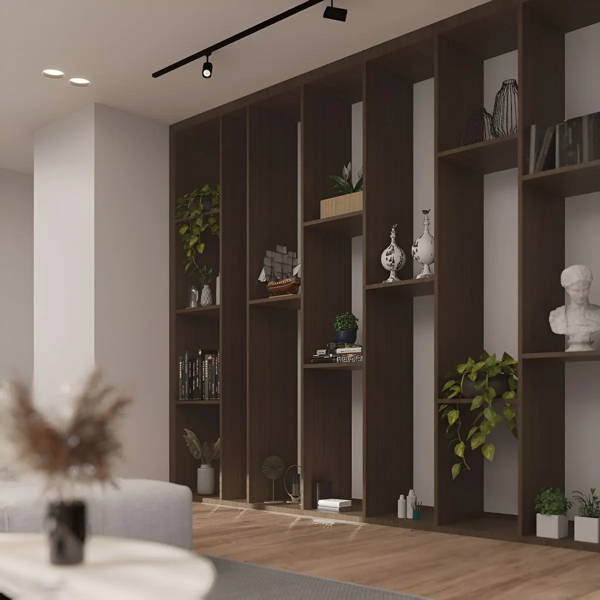
- One display moment per room — a single lit niche or a short open shelf — rather than display everywhere.
If storage is your bottleneck, start with our small-apartment storage ideas; restraint is much easier once everything has a home.
Where to spend, where to save
Restraint is ultimately a budgeting decision: spend on what you touch, use and see every day; save on what is fashionable this year. This is how we usually advise clients to divide money when the total is fixed.
| Spend more on | Why | Save on | Why |
|---|---|---|---|
| Drawer channels, hinges and kitchen hardware | Used dozens of times a day; failures are expensive to fix later | Decorative accessories | Easy to add later, once you know the room |
| Mattress, sofa and dining chairs | Comfort decides whether a room is used | Accent wallpaper and 3D panels | Date quickly and are hard to remove cleanly |
| Kitchen countertop and sink | Takes heat, turmeric and daily scrubbing | Multiple ceiling levels | Add cost, dust ledges and visual noise |
| Lighting quality (CRI 90+, warm 2700–3000K) | Makes every other material look right | Trend colours on large surfaces | Use them on cushions, not on wardrobes |
| Waterproof carcass (BWP ply) in wet areas | Central India’s monsoon finds every weak joint | Statement furniture you have not tested | Live in the room first, then buy |
Colour and light, held back
Colour is where restraint is most visible. The classic 60-30-10 proportion is a good starting point: about 60% of the visible surface in a dominant tone (walls, large storage), 30% in a secondary tone (floor, sofa, curtains) and 10% in an accent (cushions, art, a single chair). In practice we often go further and let the accent be a material — brass, cane, a deep-toned wood — rather than a colour.
Light needs the same discipline. A room lit by twelve downlights at 6500K feels like a clinic, however expensive its finishes. Fewer, warmer sources at different heights — a cove, a floor lamp, a reading light — make a room feel calm. Our colour guide and living room lighting guide cover both in detail.
A restraint audit, room by room
If you already live in a finished home, you can apply all of this without a renovation. Spend an afternoon with this list.
| Room | Edit out | Keep or add |
|---|---|---|
| Entrance | Shoes on the floor, stacked bags, extra décor | One closed shoe cabinet, one hook rail, one mirror |
| Living room | Second TV, glass showcase of gifts, more than two side tables | One feature wall, one reading corner, a rug that defines the seating |
| Dining | Table runner plus centrepiece plus placemats | A clear table; one pendant centred over it |
| Kitchen | Appliances that live on the counter but are used monthly | Closed tall unit for appliances; one clear 600 mm prep zone |
| Bedrooms | Chairs used as wardrobes, dressing-table clutter | Full-height wardrobe, a bedside that closes, warm 2700K light |
| Balcony | Broken planters, storage boxes, drying racks left out | Two or three healthy plants, a foldable drying rack that stores away |
How we apply this at Jainify
None of this is a style we impose. Some of our clients love pattern, colour and collected objects, and a restrained process makes those homes better too — because the patterns get room to read. What we bring is the editing:
- We limit choices to two or three well-matched options per decision, so selection days do not turn into forty-sample marathons.
- We build a single material board for the whole home before drawings are finalised. You can start your own on our mood board.
- We plan storage and electrical points first, finishes second, decoration last — the order described in our process.
- We give every room one idea, and we write it down. If a later addition does not support that sentence, it does not go in.
The result is rarely the most photographed home on the block in its first month. It tends to be the one that still looks right — and still works — ten years later. That, to us, is what residential interior design is for.
FAQ